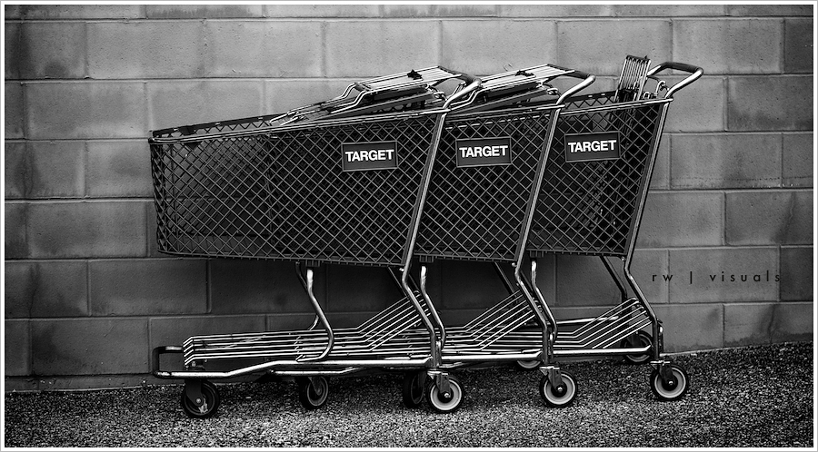
Recently I've been investing what little free time I can scrape together into studying 5D cinematography, and it led me to appreciate the 16x9 aspect ratio of a frame. Although I don't assume it will become a habit with my still work, these images are cropped with a cinema ratio in mind. They were shot as stills and intended to better illustrate the look of a short film I'm considering producing. The post work seen here would be the goal of the color grade for the final look, although I'm not sure I'm capable of replicating it with film. My ability to create a look for still photography far surpasses my ability to grade film at the moment, although my goal is to equal those aptitudes in the near future. The first image was lit with an ordinary household lamp, and the keyboard shots were lit with a small flashlight. I am absolutely in love with the shallow depth of field the 5D is capable of producing, provided the right lens is utilized. Here, all three images were shot with a Canon 50mm ƒ1.4, wide open.
As a side note, you may have noticed this is a slideshow featuring multiple images. It's the first of it's kind on my blog. As a viewer, I'm usually not a fan of slideshows as a means of presenting images in a portfolio. This is generally because I prefer to choose how long I view a particular image. Pausing seems like a viable option, though most slideshows I've seen on the web have incredibly abnoxious controls that distract from the image being displayed. In the past, if I wanted to publish multiple images from a shoot, I accomplished it by publishing one with my writing as an excerpt, which meant only one image would be displayed. To view the accompanying images, clicking on the title of the post was necessary. I've often wondered if anyone realized more images were available when publishing them in that manner, and I've experimented with different ways of improving the issue. My preference is to maintain a very clean, minimal aesthetic on my blog, and nothing really lent itself well to doing that...until this slideshow feature came about! This particular slideshow doesn't stray too far from the minimalist design of the blog, so I'll try it in several upcoming posts to get a feel for it. To freeze on a specific frame, simply click the image when it appears. Once frozen, hover your mouse over the left or right center and controls will appear, allowing you to advance or go back. Please comment if you find the slideshow distracting, or if you prefer it over the original method. Your feedback is welcome.
Ryan Walters | St. Louis Photographer + Cinematographer


